

Every startup asks something of its potential customers. Sometimes it’s a purchase. Sometimes it’s an email address, a demo request, or just a few extra minutes of attention. People rarely give these things away unless they are confident in what they are looking at.
Your homepage plays a big role in creating this trust. Every headline, phrase, button, and piece of evidence helps visitors decide whether your business understands their problem and offers a solution worth exploring.
When your message is clear, specific and credible, people spend less time understanding what you’re doing and more time thinking about what’s next. This is even more important when your business does not have a well-known name.
This article discusses practical ways to build trust through homepage messages that give visitors clear answers and strong reasons to keep moving forward.

We earn a commission if you make a purchase, at no extra cost to you.

We earn a commission if you make a purchase, at no extra cost to you.
Define your ideal user
A homepage that tries to speak to everyone ends up not resonating with anyone.
When your message remains broad, visitors need to consider whether your product applies to them. The truth is that most won’t care.
Startups that convert well early on are usually the ones that are willing to make it clear who they’re talking to, even if that means excluding some visitors in the process.
- Start by naming your audience directly in the text on your homepage. This doesn’t require a dedicated “Who is this for” section, although that can work as well. A well-placed sentence, like “designed for independent consultants” Or “designed for teams under 20“, tells the right visitor that they are in the right place within seconds. This recognition drives engagement more reliably than any generic value statement.
- From there, use the language your ideal customer actually uses. Extract phrases from sales calls, support tickets, or customer reviews. If your audience describes their problem in a certain way, mirror that language back to them. This indicates that you understand their world without having to explicitly say so.
- Specificity also helps with positioning. A homepage that clearly defines its audience is more difficult to confuse with that of a competitor. This gives visitors a more specific reason to choose you over a broader alternative that technically does the same thing.
Clarify your value in one sentence
The header of your homepage carries more weight than any other row on your site.
Eye tracking research shows visitors spend about 57% of their page time above the foldmeaning whatever is at the top either gets their attention or loses it. A vague title burns out this window quickly.
The fix is simpler than most founders expect:
- Write a sentence that tells visitors exactly what you do, who you do it for, and what they get out of it.
- Stop the clever puns. Cut abstract positioning.
- If someone unfamiliar with your industry reads your headline and immediately understands your offering, you’re right. If they need to scroll or click to understand it, rewrite it.
- Identify the most important thing your product does for a customer. So name it clearly.
- Pair it with a short line of microcopy below that adds a practical detail (e.g. clarifying platform, format, or audience). Lead with whatever eliminates the most remaining doubts.
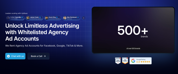
A clear example of what this looks like can be seen by Outcrya company that rents agency advertising accounts for platforms like Meta, Google and TikTok to advertisers who need high access and higher spending limits.
Their homepage header has the main benefit, and a short line directly below names the specific platforms and rental model. In turn, visitors understand the product, mechanism and relevance to them without clicking a single link.
This is the standard to aim for.
Source: uproas.io
Establish Credibility Immediately
Visitors arriving on your homepage have a default level of skepticism, and for startups, that bar is higher than for established brands. They don’t know you yet, and generic statements like “trust,” “experienced,” Or “professional“Don’t move the needle.
What moves him is specificity, like a named person, a verifiable title, or concrete history that gives visitors something real to hold on to.
Here’s how to establish your credibility from the start:
- Lead with hard-to-falsify evidence. Put a real name and face behind your product.
- Reference specific experience, such as years in the field, professional background or relevant qualification.
- If you have partnerships with recognizable platforms or brands, showcase them early. Visitors process logos and credentials quickly, and familiar names convey confidence in a way that self-written copy can’t replicate.
- Also consider directly addressing competitors’ weaknesses. If your space has a credibility problem (and many do), naming it indicates that you understand the landscape and have built your service specifically to solve it. It’s a more convincing signal of trust than any badge.
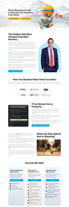
Start in Wyominga service that helps non-U.S. entrepreneurs and residents form Wyoming LLCs and establish a legitimate business presence in the United States, does it well.
Their homepage puts the founder front and center – a practicing Wyoming attorney with over a decade of legal experience. They point out that most competing services aren’t even based in Wyoming and back up their claims with official partnerships with recognizable platforms like Mercury and Relay.
This removes hesitation at the precise moment when it is most likely to drive a visitor away.
Source: startinwyoming.com
Let customer success do the talking
You can describe your product a hundred different ways, and none of them will hit as hard as a real customer saying it worked.
Research confirms this. 71% of marketers rely on customer success stories specifically to build trust and credibility with potential buyers.
On a startup’s homepage, where you’re asking strangers to take a chance on something that hasn’t yet been proven, this type of social proof does a job that your own copy can’t do.
Here’s how to do it:
- Take your strongest testimonials and associate each of them with a face, a logo and a result worth quoting.
- If you have a video, use it. If you have case study data, link to it.
- Give visitors enough content to feel convinced and a clear path to learn more if they want.
- Keep homepage versions short. A sentence or two from the client, their name and role, and their company logo covers it.
- The full story should be just a click away for anyone who needs more convincing.
The key is presentation. A five-star rating wall looks generic. A specific story with a named person, a recognizable company, and a concrete outcome feels real.
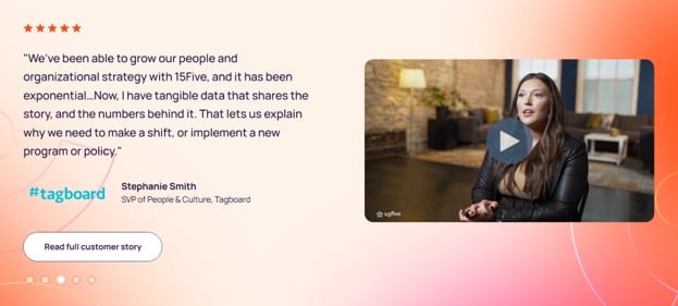
15Fivean AI-powered platform designed to help businesses track and improve the performance of their teams, puts this into practice in a clear way.
Their homepage features snippets of customer success stories, each combining a customer quote, the company logo, a short video of a company representative, and credentials. Visitors get a credible overview right from the start, with comprehensive case studies just a click away.
That’s enough detail to convince without being overwhelming.
Source: 15five.com
Replace Claims with Evidence
Every startup homepage says something like “powerful,” “seamless,” Or “the best in its category.“Visitors read these words so many times that they stopped registering them.
The problem is not that the founders are lying. The fact is that unverifiable claims and hard evidence seem identical at first glance, so readers treat both with the same skepticism. Those who cross lead to the place with evidence.
Here’s how to do it:
- Check your homepage text for each adjective that describes the quality of your product.
- For each, ask if you have a number, note, or third-party source that makes the same point more convincingly.
- Swap the adjective for the evidence. If you have been reviewed on platforms like Trustpilot, G2 or Capterra, display these ratings with badges.
- If you have usage data, such as customers served, transactions processed, or countries reached, put those numbers in a visible location. Third-party validation carries more weight than self-reported claims because visitors didn’t read it on your site first.
- Keep the numbers up to date and honest. Inflated numbers damage confidence more quickly than no numbers at all.
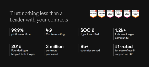
LawA toolkit that helps legal and business teams automate their contract workflows from inception to signing handles this well.
Their homepage dedicates space to third-party reviews from platforms like G2 and Capterra, as well as operational metrics covering contracts processed and markets served. The badges confirm what independent raters think, and the numbers add context about the scale.
Together, they replace vague claims of quality with a concrete image of a product that already performs in volume in multiple markets.
Source: juro.com
Final Thoughts
A strong message on the homepage determines how quickly a visitor understands your product and how confident they are in moving forward.
Every section of your homepage plays a role in this process, from a clear value statement to evidence, trust signals, and customer testimonials. When these elements work together, visitors spend less time guessing and more time evaluating suitability.
Small adjustments in language, structure, and supporting details often lead to noticeable changes in engagement and conversion.
Trust on the homepage is built step by step. Each line reduces doubt or adds friction. So keep refining until your message is easy to understand and believe.
Image by DC Studio on Magnific